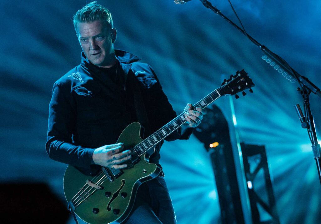
There’s something inherently cool about an unreadable logo.
While not acutely being a way to gatekeep metal, the unreadable nature of a lot of band logos means that “if you know… you know.” Metal is a club for everyone, but the unreadable nature of some logos keep it underground and out of the influence of the mainstream, this goes for corpse paint on stage, or theatrical stage outfits – it’s expression of the most extreme order!
There’s a fine line between a good unreadable logo, and an unreadable logo that is complex for the sake of it. There’s also decades of short-lived bands with admittedly awesome metal band logos, but let’s celebrate bands currently doin’ it. We’ve credited artists and designers where we can, but we’d love to complete the list if you know who designed your favourite logos. Contact us!
Read all the latest features, columns and more here.
Here’s seven current bands doing unreadable metal band logos well!
Sanguisugabogg
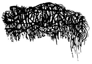
Sanguisugabogg hail from Ohio and are leading a revival of brutal death metal. Their logo reflects their music; sludgy, filthy, highly contrasted with slow and fast sections, swapping between supreme groove and abrasive speed.
Slamming, bass heavy grooves are provided by guitarists Cedrik Davis and Drew Arnold, who serve as the band’s bass players as well; they split their signal, pitch-shifted, into bass amps for inhumanely tight ‘bass’ parts.
The guitars are offset by drummer Cody Davidson, against jumping seamlessly between slamming speed and slow, accented grooves. Vocalist Devin Swank leads it all, shifting easily through a myriad of equally inhumane noises. Sanguisugabogg’s now (in)famous logo was designed by Bridgette Barnes.
Worm
Worm are led mostly by Phantom Slaughter, with guitarist Wroth Septentrion having joined in 2021. They have a few logos, all equally unreadable, having released consistently since 2014 with EPs, albums and demos available.
They pull influence from Lovecraft, goth and the occult, Worm’s music having an oppressive feeling, the darkness of it all surrounding you. Worm’s logo was designed by Mark Riddick.
Weigedood
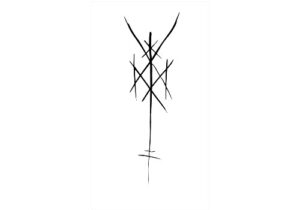
Weigedood are a supergroup of sorts, formed before 2015’s debut De Doden Hebben Het Goed, featuring members of Belgium’s biggest alternative metal scene: Oathbreaker and Rise and Fall, Hessian and Amenra.
Breaking away from their post metal and hardcore roots, Weigedood are a ferocious blend of black and death metal, their logo instead reminiscent of a ritualistic, pagan insignia or altar of sorts. Weigedood’s logo is a sigil, based on a runic alphabet designed by Fia Cielen.
200 Stab Wounds
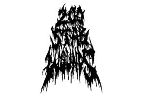
200 Stab Wounds burst out of the gate with 2021’s Slave To The Scalpel. While having formed in 2019, that record skyrocketed them to the limelight, seamlessly blending old school death metal and accessible hardcore sensibility.
The band has since gone on to release the Masters of Morbidity single, a taste of the future for the band. 200 Stab Wounds’ logo is amongst the more readable on this list, but again speaks to the gorey, horror-themed lyricism of their music.
Bloodbath
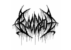
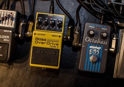
Bloodbath are mainstays of the death metal genre, having been a constant proponent of Boss’s HM-2 pedal since they formed in Sweden in 1998. Original fronted by Opeth’s Mikael Åkerfeldt, the band’s logo is instantly recognisable amongst metal fans, as iconic as the chainsaw-esque sound of their music.
Bloodbath feature members of some huge European metal bands, having consistently toured, recorded and released albums for more than two decades, constantly re-inventing themselves, and their logo, all equally unreadable. Nice.
Deafheaven
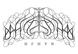
Deafheaven are an interesting addition, but one of their earlier logos needs a special mention. By the time 2013’s Sunbather elevated them to world-class act, they’d mostly done away with this mostly symmetrical, romantic, calligraphy style logo, but it’s one for the history books. This iteration of their logo was designed by Karlynn Holland and Nick Steinhardt.
Doing metal their own way, this logo pays homage to their own unique take on their black metal roots.
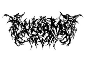
Revocation
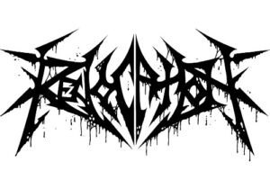
Revocation are a modern band fronted by Dave Davidson, who’ll force most of you guitarists to a fork in the road: practice night and day to be as good as him, or give up. Revocation’s logo isn’t supremely unreadable, but it’s symmetry and Metallica-esque angles are again, a nod to their music. 2o14 saw the current “Rotten” logo, with the addition of drips and filth. The “Rotten” logo was done by Mark Riddick.
Revocation blend thrash, death metal and hardcore, with soaring solos and ultra-complex, jazz-infused riffs and licks, always with a tongue in cheek approach.
Imperial Triumphant
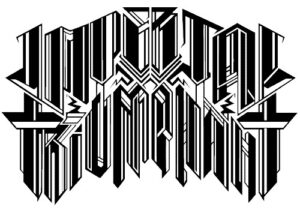
Imperial Triumphant are a relative newcomer to the international scene, but boy oh boy did they make a splash. They bring notes of noise, death metal, jazz and fusion to their sound. Their stage costumes match their logo, embroidered in gold, while their music has an ethereal, triumphant sound to it, like the a ringing of victory from an organ; their logo also resembling an organ or even a castle.
You can make up your own mind about that one. Imperial Triumphant’s logo was designed by Andrew Tremblay.
Christophe Szpajdel is an illustrator hailed as ‘Lord of the Logos’, having designed for Emperor, Old Man’s Child, Enthroned, Borknagar, Moonspell, Desaster. Read more about him here.